Essay 1
The charts below compare the age structure of the populations of France and India in 1984.
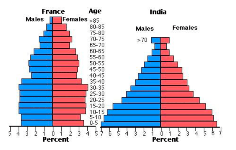
The two charts compare the populations of France and India in terms of age distribution by gender in the year 1984.
It is clear that the population of India was younger than that of France in 1984, with a noticeably larger proportion of people aged under 20. France, on the other hand, had a significantly larger percentage of elderly inhabitants.
In India, close to 14% of people were aged 5 or under, and each five-year age bracket above this contained an increasingly smaller proportion of the population. France’s population, by contrast, was more evenly distributed across the age ranges, with similar figures (around 7% to 8% of all people) for each five-year cohort between the ages of 0 and 40. Somewhere between 10% and 15% of all French people were aged 70 or older, but the equivalent figure for India was only 2%.
Looking more closely at gender, there was a noticeably higher proportion of French women than men in every cohort from age 50 upwards. For example, almost 3% of French 70- to 75-year-olds were women, while just under 2% were men. No significant gender differences can be seen on the Indian population chart.
(199 words, band 9)
Essay 2
The bar graph shows the global sales (in billions of dollars) of different types of digital games between 2000 and 2006
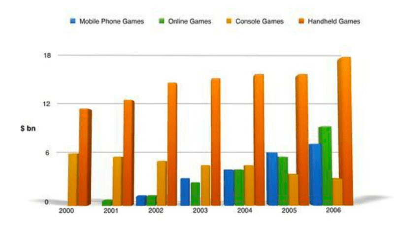
The bar chart compares the turnover in dollars from sales of video games for four different platforms, namely mobile phones, online, consoles and handheld devices, from 2000 to 2006. It is clear that sales of games for three out of the four platforms rose each year, leading to a significant rise in total global turnover over the 7-year period. Sales figures for handheld games were at least twice as high as those for any other platform in almost every year.
In 2000, worldwide sales of handheld games stood at around $11 billion, while console games earned just under $6 billion. No figures are given for mobile or online games in that year. Over the next 3 years, sales of handheld video games rose by about $4 billion, but the figure for consoles decreased by $2 billion. Mobile phone and online games started to become popular, with sales reaching around $3 billion in 2003.
In 2006, sales of handheld, online and mobile games reached peaks of 17, 9 and 7 billion dollars respectively. By contrast, turnover from console games dropped to its lowest point, at around $2.5 billion.(187)
Essay 3
The chart below shows the total number of Olympic medals won by twelve different countries.
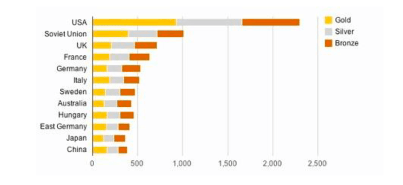
The bar chart compares twelve countries in terms of the overall number of medals that they have won at the Olympic Games. It is clear that the USA is by far the most successful Olympic medal winning nation. It is also noticeable that the figures for gold, silver and bronze medals won by any particular country tend to be fairly similar.
The USA has won a total of around 2,300 Olympic medals, including approximately 900 gold medals, 750 silver and 650 bronze. In second place on the all-time medals chart is the Soviet Union, with just over 1,000 medals. Again, the number of gold medals won by this country is slightly higher than the number of silver or bronze medals.
Only four other countries – the UK, France, Germany and Italy – have won more than 500 Olympic medals, all with similar proportions of each medal colour. Apart from the USA and the Soviet Union, China is the only other country with a noticeably higher proportion of gold medals (about 200) compared to silver and bronze (about 100 each).(178 words, band 9)
Essay 4
The charts below show the main reasons for study among students of different groups and the amount of support they received from employers.
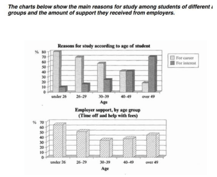
The bar charts compare students of different ages in terms of why they are studying and whether they are supported by an employer. It is clear that the proportion of students who study for career purposes is far higher among the younger age groups, while the oldest students are more likely to study for interest. Employer support is more commonly given to younger students.
Around 80% of students aged under 26 study to further their careers, whereas only 10% study purely out of interest. The gap between these two proportions narrows as students get older, and the figures for those in their forties are the same, at about 40%. Students aged over 49 overwhelmingly study for interest (70%) rather than for professional reasons (less than 20%).
Just over 60% of students aged under 26 are supported by their employers. By contrast, the 30-39 age group is the most self-sufficient, with only 30% being given time off and help with fees. The figures rise slightly for students in their forties and for those aged 50 or more.(178 words, band 9)
Essay 5
The chart below shows numbers of incidents and injuries per 100 million passenger miles travelled (PMT) by transportation type in 2002.
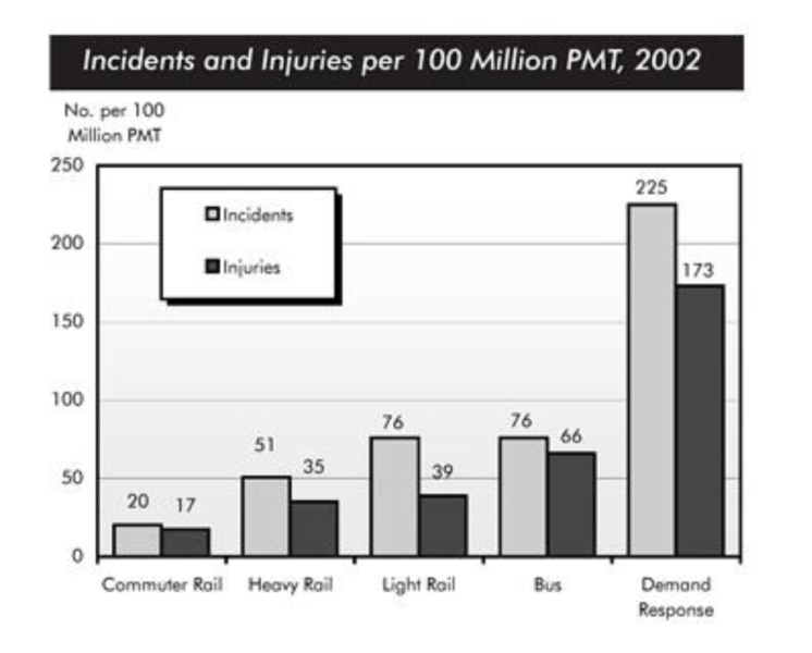
The bar chart compares the number of incidents and injuries for every 100 million passenger miles travelled on five different types of public transport in 2002. It is clear that the most incidents and injuries took place on demand-response vehicles. By contrast, commuter rail services recorded by far the lowest figures.
A total of 225 incidents and 173 injuries, per 100 million passenger miles travelled, took place on demand-response transport services. These figures were nearly three times as high as those for the second highest category, bus services. There were 76 incidents and 66 people were injured on buses.
Rail services experienced fewer problems. The number of incidents on light rail trains equalled the figure recorded for buses, but there were significantly fewer injuries, at only 39. Heavy rail services saw lower numbers of such events than light rail services, but commuter rail passengers were even less likely to experience problems. In fact, only 20 incidents and 17 injuries occurred on commuter trains.(165 words, band 9)
Essay 6
The chart below shows information about changes in average house prices in five different cities between 1990 and 2002 compared with the average house prices in 1989.
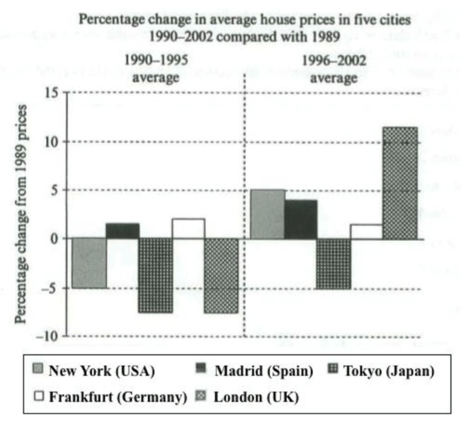
The bar chart compares the cost of an average house in five major cities over a period of 13 years from 1989. We can see that house prices fell overall between 1990 and 1995, but most of the cities saw rising prices between 1996 and 2002. London experienced by far the greatest changes in house prices over the 13-year period.
Over the 5 years after 1989, the cost of average homes in Tokyo and London dropped by around 7%, while New York house prices went down by 5%. By contrast, prices rose by approximately 2% in both Madrid and Frankfurt.
Between 1996 and 2002, London house prices jumped to around 12% above the 1989 average. Homebuyers in New York also had to pay significantly more, with prices rising to 5% above the 1989 average, but homes in Tokyo remained cheaper than they were in 1989. The cost of an average home in Madrid rose by a further 2%, while prices in Frankfurt remained
Essay 7
The bar chart below shows money spent on consumer goods in different countries.
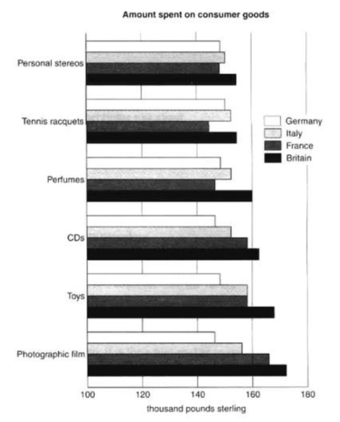
The bar chart compares consumer spending on six different items in Germany, Italy, France and Britain. It is clear that British people spent significantly more money than people in the other three countries on all six goods. Of the six items, consumers spent the most money on photographic film.
People in Britain spent just over £170,000 on photographic film, which is the highest figure shown on the chart. By contrast, Germans were the lowest overall spenders, with roughly the same figures (just under £150,000) for each of the six products.
The figures for spending on toys were the same in both France and Italy, at nearly £160,000. However, while French people spent more than Italians on photographic film and CDs, Italians paid out more for personal stereos, tennis racquets and perfumes. The amount spent by French people on tennis racquets, around £145,000, is the lowest figure shown on the chart.(150)
Essay 8
The chart below shows the amount of time that 10 to 15-year-olds spend chatting on the Internet and playing on games consoles on an average school day in the UK.
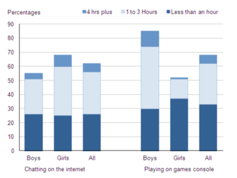
Introduction The bar chart compares the time spent by 10 to 15-year-olds in the UK on two activities, namely chatting online and playing computer games.
Overview Overall, we can see that playing computer games is marginally more popular than chatting on the Internet. However, completely different trends can be seen if we look at the specific figures for boys and girls.
Boys aged between 10 and 15 clearly favour playing on games consoles over chatting online. According to the chart, while 85% of boys play computer games every day, only 55% chat online daily. Furthermore, the majority of boys play on their consoles for more than one hour each day, and 10% do this activity for four hours or more.
By contrast, girls prefer chatting online. Close to 70% of 10 to 15-year-old girls engage in online conversation each day, compared to about 50% of this cohort who play computer games. Of the girls who do play on consoles, most of them play for less than an hour, whereas most girls who chat online do so for more than one hour, and nearly 10% chat for four hours or more.(188)
Essay 9
The chart below shows the total number of minutes (in billions) of telephone calls in the UK, divided into three categories, from 1995-2002.
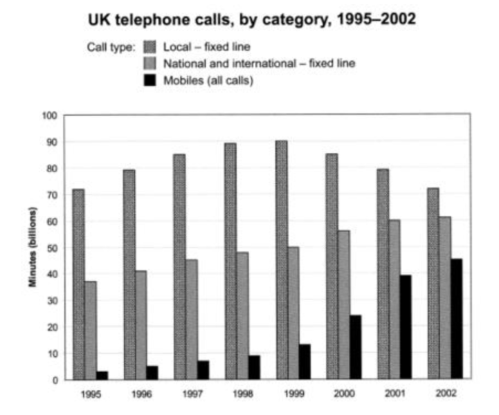
The bar chart compares the amount of time spent by people in the UK on three different types of phone call between 1995 and 2002.
It is clear that calls made via local, fixed lines were the most popular type, in terms of overall usage, throughout the period shown. The lowest figures on the chart are for mobile calls, but this category also saw the most dramatic increase in user minutes.
In 1995, people in the UK used fixed lines for a total of just over 70 billion minutes for local calls, and about half of that amount of time for national or international calls. By contrast, mobile phones were only used for around 4 billion minutes. Over the following four years, the figures for all three types of phone call increased steadily.
By 1999, the amount of time spent on local calls using landlines had reached a peak at 90 billion minutes. Subsequently, the figure for this category fell, but the rise in the other two types of phone call continued. In 2002, the number of minutes of national / international landline calls passed 60 billion, while the figure for mobiles rose to around 45 billion minutes.
(197 words, band 9)
Tìm hiểu về Online Course cho học viên IELTS