Bài 1
The table below shows the amount of waste production (in millions of tonnes) in six different countries over a twenty-year period.
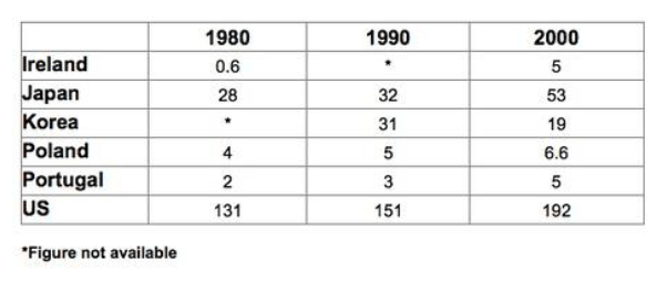
The chart compares the amounts of waste that were produced in six countries in the years 1980, 1990 and 2000.
In each of these years, the US produced more waste than Ireland, Japan, Korea, Poland and Portugal combined. It is also noticeable that Korea was the only country that managed to reduce its waste output by the year 2000.
Between 1980 and 2000, waste production in the US rose from 131 to 192 million tonnes, and rising trends were also seen in Japan, Poland and Portugal. Japan’s waste output increased from 28 to 53 million tonnes, while Poland and Portugal saw waste totals increase from 4 to 6.6 and from 2 to 5 million tonnes respectively.
The trends for Ireland and Korea were noticeably different from those described above. In Ireland, waste production increased more than eightfold, from only 0.6 million tonnes in 1980 to 5 million tonnes in 2000. Korea, by contrast, cut its waste output by 12 million tonnes between 1990 and 2000.
Bài 2
The table below shows changes in the numbers of residents cycling to work in different areas of the UK between 2001 and 2011.
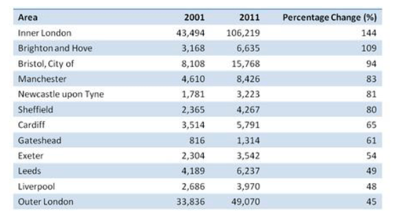
The table compares the numbers of people who cycled to work in twelve areas of the UK in the years 2001 and 2011.
Overall, the number of UK commuters who travelled to work by bicycle rose considerably over the 10-year period. Inner London had by far the highest number of cycling commuters in both years.
In 2001, well over 43 thousand residents of inner London commuted by bicycle, and this figure rose to more than 106 thousand in 2011, an increase of 144%. By contrast, although outer London had the second highest number of cycling commuters in each year, the percentage change, at only 45%, was the lowest of the twelve areas shown in the table.
Brighton and Hove saw the second biggest increase (109%) in the number of residents cycling to work, but Bristol was the UK’s second city in terms of total numbers of cycling commuters, with 8,108 in 2001 and 15,768 in 2011. Figures for the other eight areas were below the 10 thousand mark in both years.
(172 words, band 9)
Bài 3
The table below gives information on consumer spending on different items in five different countries in 2002.
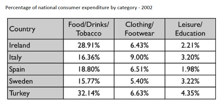
The table shows percentages of consumer expenditure for three categories of products and services in five countries in 2002.
It is clear that the largest proportion of consumer spending in each country went on food, drinks and tobacco. On the other hand, the leisure/education category has the lowest percentages in the table.
Out of the five countries, consumer spending on food, drinks and tobacco was noticeably higher in Turkey, at 32.14%, and Ireland, at nearly 29%. The proportion of spending on leisure and education was also highest in Turkey, at 4.35%, while expenditure on clothing and footwear was significantly higher in Italy, at 9%, than in any of the other countries.
It can be seen that Sweden had the lowest percentages of national consumer expenditure for food/drinks/tobacco and for clothing/footwear, at nearly 16% and just over 5% respectively. Spain had slightly higher figures for these categories, but the lowest figure for leisure/education, at only 1.98%.
Bài 4
The table below shows the proportion of different categories of families living in poverty in Australia in 1999.
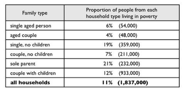
The table gives information about poverty rates among six types of household in Australia in the year 1999.
It is noticeable that levels of poverty were higher for single people than for couples, and people with children were more likely to be poor than those without. Poverty rates were considerably lower among elderly people.
Overall, 11% of Australians, or 1,837,000 people, were living in poverty in 1999. Aged people were the least likely to be poor, with poverty levels of 6% and 4% for single aged people and aged couples respectively.
Just over one fifth of single parents were living in poverty, whereas only 12% of parents living with a partner were classed as poor. The same pattern can be seen for people with no children: while 19% of single people in this group were living below the poverty line, the figure for couples was much lower, at only 7%.
(150 words, band 9)
Bài 5
The table below gives information about the underground railway systems in six cities.
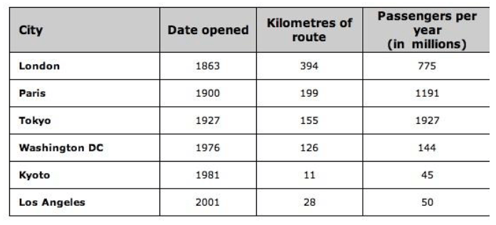
The table shows data about the underground rail networks in six major cities.
The table compares the six networks in terms of their age, size and the number of people who use them each year. It is clear that the three oldest underground systems are larger and serve significantly more passengers than the newer systems.
The London underground is the oldest system, having opened in 1863. It is also the largest system, with 394 kilometres of route. The second largest system, in Paris, is only about half the size of the London underground, with 199 kilometres of route. However, it serves more people per year. While only third in terms of size, the Tokyo system is easily the most used, with 1927 million passengers per year.
Of the three newer networks, the Washington DC underground is the most extensive, with 126 kilometres of route, compared to only 11 kilometres and 28 kilometres for the Kyoto and Los Angeles systems. The Los Angeles network is the newest, having opened in 2001, while the Kyoto network is the smallest and serves only 45 million passengers per year.
(185 words)
Bài 6
The table above shows the percentage of mobile phone owners using various mobile phone features. Write a report of at least 150 words, summarizing the information and making comparisons where relevant.
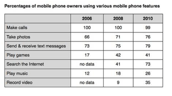
The table compares the percentages of people using different functions of their mobile phones between 2006 and 2010.
Throughout the period shown, the main reason why people used their mobile phones was to make calls. However, there was a marked increase in the popularity of other mobile phone features, particularly the Internet search feature.
In 2006, 100% of mobile phone owners used their phones to make calls, while the next most popular functions were text messaging (73%) and taking photos (66%). By contrast, less than 20% of owners played games or music on their phones, and there were no figures for users doing Internet searches or recording video.
Over the following 4 years, there was relatively little change in the figures for the top three mobile phone features. However, the percentage of people using their phones to access the Internet jumped to 41% in 2008 and then to 73% in 2010. There was also a significant rise in the use of mobiles to play games and to record video, with figures reaching 41% and 35% respectively in 2010.
Bài 7
The tables below give information about sales of Fairtrade*-labelled coffee and bananas in 1999 and 2004 in five European countries.
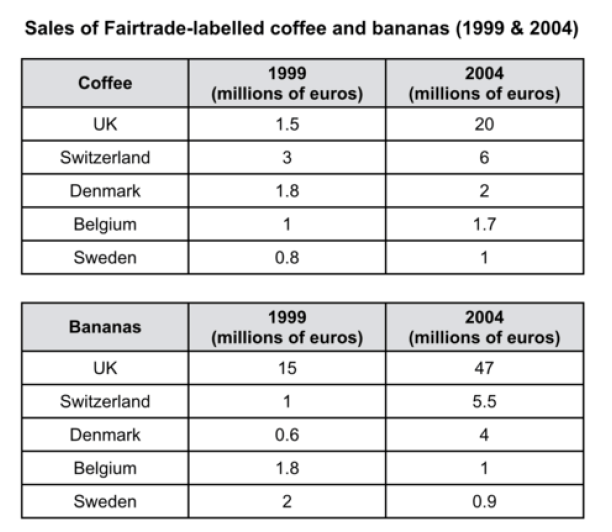
The tables show the amount of money spent on Fairtrade coffee and bananas in two separate years in the UK, Switzerland, Denmark, Belgium and Sweden.
It is clear that sales of Fairtrade coffee rose in all five European countries from 1999 to 2004, but sales of Fairtrade bananas only went up in three out of the five countries. Overall, the UK saw by far the highest levels of spending on the two products.
In 1999, Switzerland had the highest sales of Fairtrade coffee, at €3 million, while revenue from Fairtrade bananas was highest in the UK, at €15 million. By 2004, however, sales of Fairtrade coffee in the UK had risen to €20 million, and this was over three times higher than Switzerland’s sales figure for Fairtrade coffee in that year. The year 2004 also saw dramatic increases in the money spent on Fairtrade bananas in the UK and Switzerland, with revenues rising by €32 million and €4.5 million respectively.
Sales of the two Fairtrade products were far lower in Denmark, Belgium and Sweden. Small increases in sales of Fairtrade coffee can be seen, but revenue remained at €2 million or below in all three countries in both years. Finally, it is noticeable that the money spent on Fairtrade bananas actually fell in Belgium and Sweden.
Tham khảo thêm các bài viết band 9 Writing Task 1 chủ đề Bar Chart
Tham khảo thêm các bài viết band 9 Writing Task 1 chủ đề Pie Chart
Tham khảo thêm các bài viết band 9 Writing Task 1 chủ đề Map Process
Đăng ký làm kiểm tra đầu vào miễn phí cho các lớp học IELTS tại VietAccepted